The logo is designed as a visual representation of the vision and mission of the Architecture Study Program at the Faculty of Engineering, Universitas Mataram, which emphasizes tropical architecture, sustainable tourism, and the integration of local wisdom from Lombok and Sumbawa with global advancement.
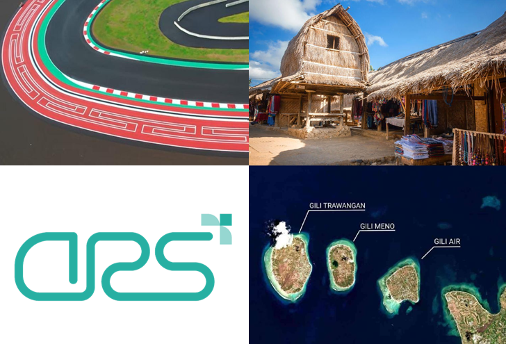
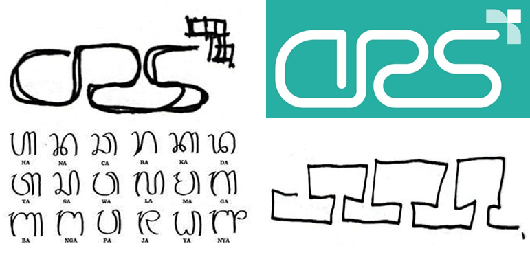
1. Lombok Motif The primary form of the logo is inspired by traditional woven motifs of the Sasak ethnic group, particularly those reinterpreted in a modern form at the run-off areas of Turns 15 and 16 of the Mandalika Circuit. This reflects the strong connection between architecture, local culture, and the development of leading tourism destinations such as Kuta Mandalika.
2. Three-Pointed Arrow The arrow pointing դեպի the upper right symbolizes progress, growth, and future direction. Its three tips represent the Three Gilis—Gili Trawangan, Gili Meno, and Gili Air—which are iconic tourism destinations in Lombok and serve as a foundation for the development of tourism-oriented architecture in the region.
3. Continuous Line The unbroken structure of the logo represents continuity and collaboration across education, research, and community engagement. It also illustrates the principle that architecture is inseparable from the socio-cultural and environmental context in which it exists.
4. Color Philosophy – Tosca Green The Tosca Green color is chosen to represent freshness, tranquility, and a close relationship with the tropical natural environment and coastal landscapes. It also signifies a strong commitment to sustainable architectural practices, in alignment with the principles of green architecture.
Mockup
We've detected you might be speaking a different language. Do you want to change to: